Occlusion: A Font Born from Light and Shadow
Birth of a font
How to express yourself in art class? That was the assignment I got in the third grade of high school. Back then, I was not only a teenager but also a classic beta kid. Expressing myself through art felt cringy. But I eventually found a way to make it work for me: creating a cool font with a geometric character. That’s when the idea of a font was born. I designed a stencil as a template to stamp my name on everything I owned — including my bedroom door.
 Image 1: Font stencil from third grade.
Fast forward to half a year ago, I decided it was time to turn that high school idea into something real. And that’s how my font, Occlusion, came to life.
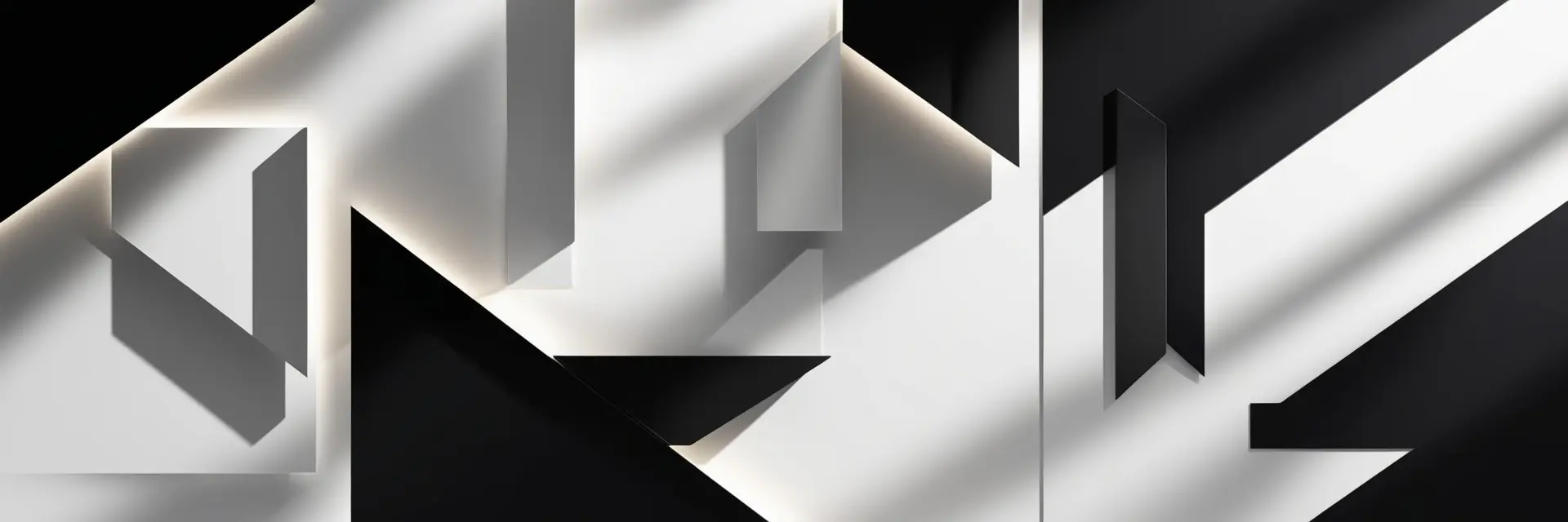
The concept
 Image 2: The birth of the Occlusion font.
What I like most, is thinking outside the box. Take the creative step and do something nobody does. Instead of designing letters as solid shapes, I decided to perceive them as voids and let the core shadow of the extruded letter be the center of attention.
Take the letter “A” for example. As you can see in Image 2, the letter is extruded to the North-East. The shadow is drawn as if a light source emitted to the North-East, which turned out to be a great source for a entire font family.
For every wind direction, there’s a version of the font: North-East (NE), South-East (SE), South-West (SW), and North-West (NW).
In Image 3, you can see how the letter “A” transforms depending on the direction of the light source.

Image 3: Letter A in every direction.
The beauty of the font lies in its illusion—at first glance, the geometric shapes appear randomly scattered. But once your brain comprehends what is going on, the design becomes impossible to unsee.
Naming your font
The first working title for the font was Excellent—a bit of wordplay inspired by “EX” for extruded and the idea of the characters being outstanding, quite literally. Plus, I liked to have the letter X in the name, since I like this one a lot and took considerable effort to perfect. However, naming your first font Excellent felt a bit presumptuous. I decided to save that name for a truly excellent font in the future.
For a more fitting name, I went to look at the anatomy of a shadow. That’s when I found the perfect match: Occlusion. The term refers to something being blocked or obscured—much like how light creates shadows when interrupted. This concept encapsulates the essence of the font, where the shadows themselves take center stage.

Image 3: Letter X in all its glory.
FontStruct
To bring Occlusion to life, I turned to FontStruct, a powerful yet user-friendly tool for font creation. I’ve used it in the past, and I appreciate its ease of use.
FontStruct lets you start simple or go all-in with its Expert Mode. With basic shapes, called bricks, you can build up your character using a grid layout. For more intricate designs, Expert Mode unlocks additional tools that can take your font to the next level.
Here’s a breakdown of the Expert Mode tools that became essential in my process.
Different pen types:
- Simple: A straightforward tool to place bricks one at a time.
- Stack: Stacks bricks on top of each other, letting you create entirely new shapes.
- Cycle: Cycles through your brick collection with each click, speeding up the creative process.
Since I’m using Expert Mode, I guess that officially makes me an expert now. I found the Cycle Pen great for working on large sections, while the Stack Pen became my go-to for crafting unique, non-existent bricks.
When using the Stack Pen, bricks can stack invisibly, which might lead to needles complex glyphs if you’re not careful.
Another game-changer in Expert Mode is Nudge. It gives the ability to nudge bricks—moving them in tiny increments of 1/8th. This precision allowed me to fine-tune details and align everything perfectly.
But the real lifesaver? Composite Bricks. This tool lets you combine two to sixteen bricks into a single new brick. When I found myself stuck, questioning my life choices, the Composite tool came to the rescue.
Take the letter “X” as an example. Image 4 shows how a composite brick was constructed out of three bricks and used to create its final form.
And if that already sounds exciting, just wait until you hear about stacking composites…
 Image 4: Usage of Composite Brick for the letter X.
The Creative Process
I remember myself sketching those characters in puzzle books or doodling on a beer mat, sketching out the entire alphabet. And before you know it, you’re revisiting designs for certain characters, searching for a fresh perspective.
The idea of the extrusion/shadow in multiple directions became the guiding principle. Designing characters that are both recognizable and visually appealing became more important.
I started by creating pixel-based letters as a foundation and refined them from there.
Take a look at Image 5 to see the evolution process leading to the final design. I chose the letter Z as an example because it proved to be one of the most challenging letters for this font
 Image 5: Shaping of the letter Z.
At 1a, you see the pixel-based version of the letter Z, while 1b shows its ‘Occlusion’ form. While the letter was recognizable from every direction and visually appealing, it felt too simplistic and slightly imperfect.
This evolved into the refined shapes of 2a. I totally got rid of the pixels and I patted myself on the back for overcoming this design challenge.
However, a new issue emerged: when extruding letters with 45-degree geometry at a 45-degree angle (e.g., North-East), parts of the diagonal axis disappear. This is evident in Image 2b, where the letter’s structure vanishes. The same problem arises with a South-West extrusion.
The solution? I removed this 45-degree angle, which resulted in the designs seen in the characters at 3a and 3b.
 Image 6: Choosing the shapes of an ampersand.
Most characters have a relatively straightforward form, though, as you’ve seen, adjustments are sometimes necessary.
However, designing a less obvious character takes significant time and effort.
Take the ampersand in Image 6 as an example. Every character in the font went through a similar process: scrutinized from a distance, evaluated through squinted eyes, and revisited after a good night’s sleep. Each one received the same attention to detail.
Once a design is selected, the character is extruded and refined in all directions. If you’re lucky, you’ll end up with a result that meets all expectations. If not, it’s back to the drawing board.
Final Design
The final design is still in the works.
As you’ve read, it takes time to perfect every detail, and I’m not one to settle for half measures. Each character deserves the same thoughtful attention, ensuring the final result is nothing short of remarkable.
While the full font family isn’t available just yet, all styles will eventually be downloadable. Until then, I’ve created a special project page where you can see the font in action and even try it out for yourself.
What’s next?
The Occlusion family is growing, introducing new styles to expand its versatility:
Occlusion Core: A stripped-down, minimal version that embodies the pure essence of the font.
Occlusion Apex: A refined, elevated version, bringing typographic sophistication to its little brother.
Occlusion Halo: A softer, more elegant twist on the Occlusion family, featuring rounded edges.
If you love it, share it with others. If you have suggestions, share them with me.